AdMob Re-Optimisations
Year: 2023
Channels: Instagram, GDN, LinkedIn
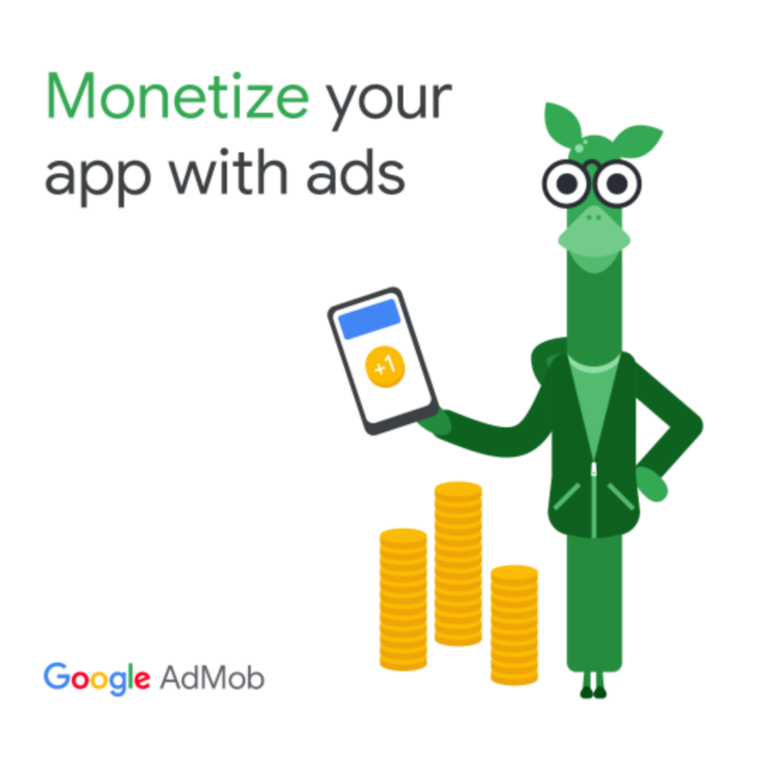
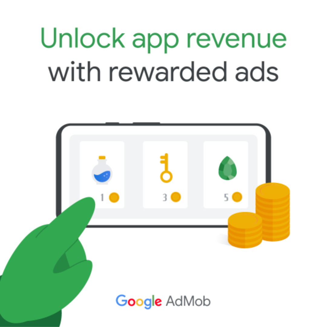
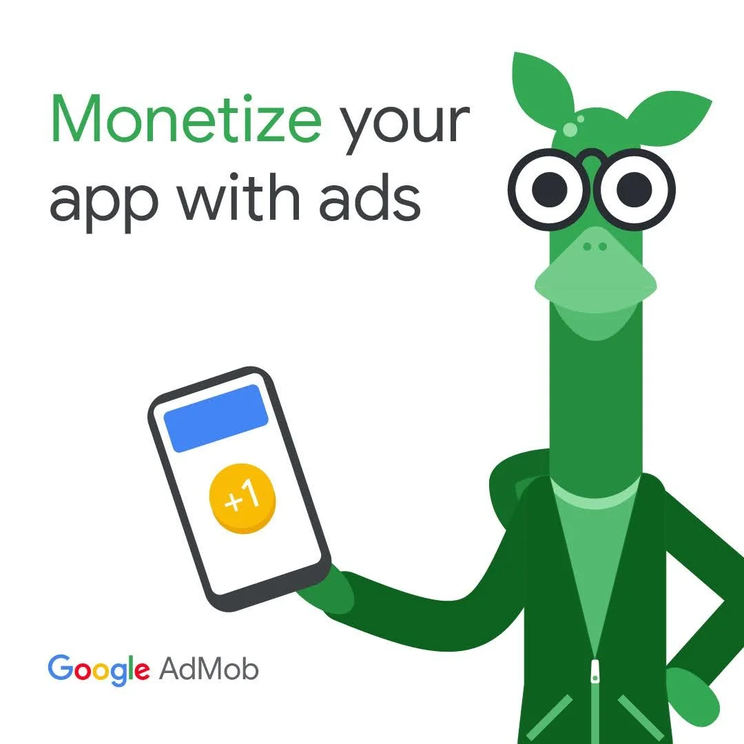
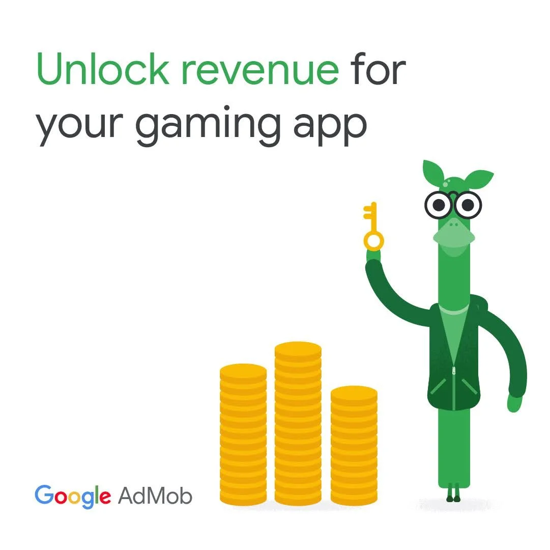
Google hired us as testing and iteration experts to help them improve their Google AdMob marketing campaigns they’d been running late in 2022. This wasn’t a brief to reimagine their assets, but to optimise them based on our own insights and expertise. Below, you’ll see each of the original ads on the left, and our optimisations on the right, with details on what was changed and why it was changed.
Ad 1
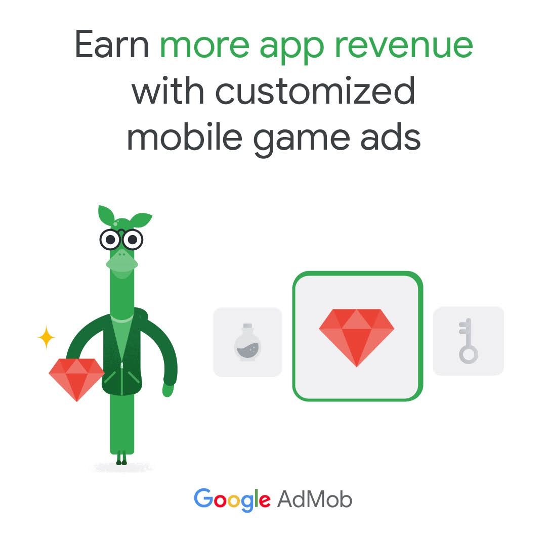
On this ad we increased the size of the illustration to make the top third of ‘Max’ the focus. This simplified the visuals to be less busy and avoid viewer fatigue.
Ad 2
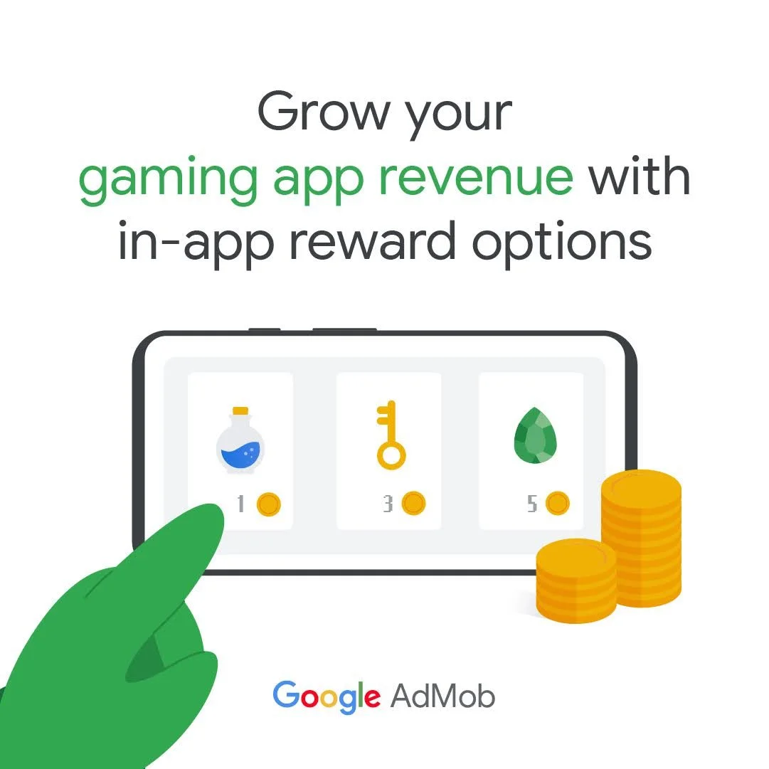
We simplified this asset by removing the padlock and in turn increasing the coin stack’s share of the space. This provided a more visual emphasis on the financial gains the audience can expect to receive.
Ad 3
We felt the iconography in the original asset was unclear and didn’t have a strong link to gaming. So, we swapped it for the more recognisable jewel symbol that would represent the common rewards gamers receive. The red also made the ads pop out a bit more versus the flatter yellow.
Ads 4 & 5
We felt both of these ads told a solid story, utilising gaming attributes to reinforce the strong, no-nonsense messaging. So instead of altering the visuals, we swapped the copy pairings which would allow us to delineate which variable brought in stronger performance. We also added in the word “gaming” on Ad 5 as its use was a proven attribute of other successful assets.
Ad 6
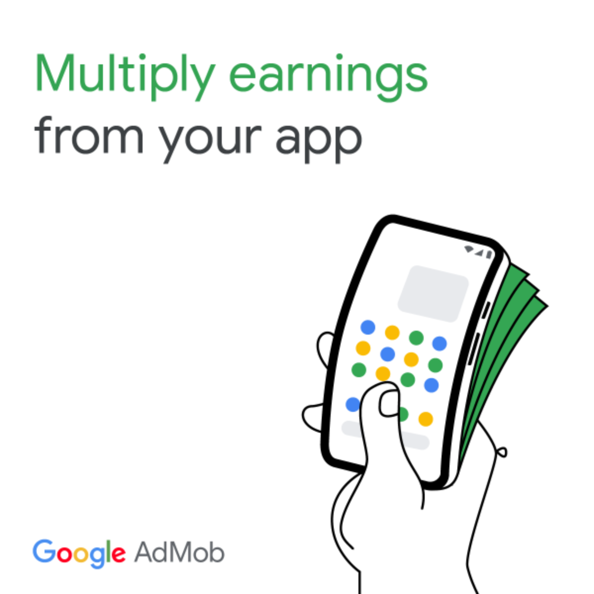
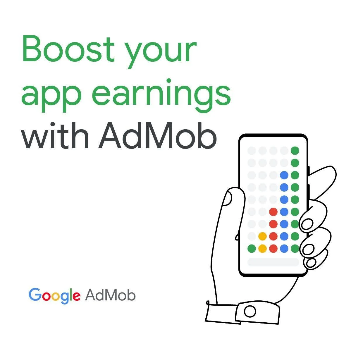
The original copy lacked the key components of what made the Gaming 2.0 Banner Ads successful; a proposition followed by an avenue to achieve it. “Boost” implies understanding that the viewer has a growth strategy for their app in place, and that partnering with AdMob will bring them more success.
Ad 7
We saw this asset as an opportunity to introduce more conversational, direct-to-viewer messaging that was more in line with the decision maker audience outlined in the brief. “Give your ad revenue a raise” tells the same story as the original copy, in a more efficient, yet still intriguing way.
Ad 8
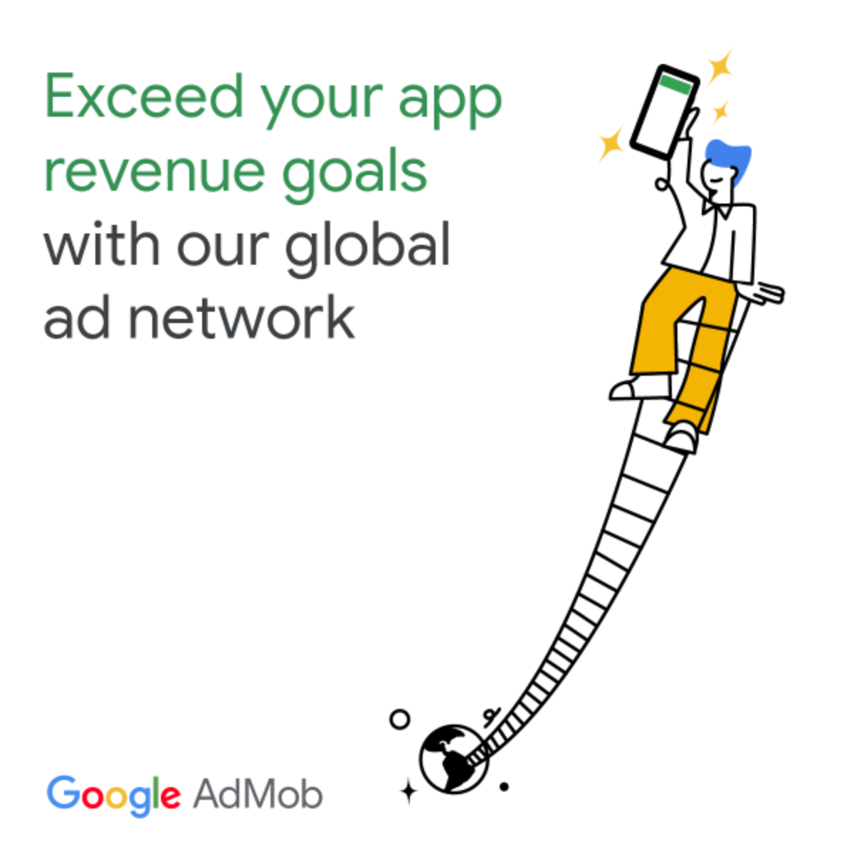
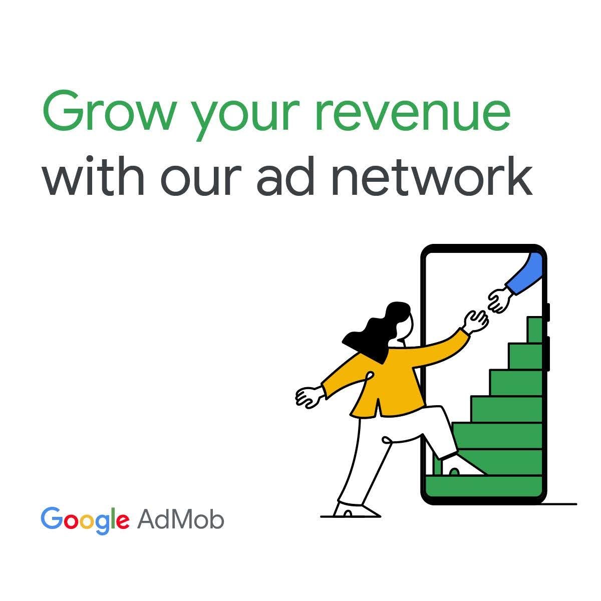
The original copy had the same issues of Ad 6 - lacking the key components of what made previous ads successful.
The balanced copy (“your” and “our”) also implies the theme of partnership, positioning AdMob to be offering its network to the viewer so they can further their app growth journey.
Ad 9
Similar to Ad 7, we saw this asset as an opportunity to make the copy more human.
“Reach new revenue goals” is more concise for quick-reading, allowing us to increase the font size and thus the message’s share of the space. Plus, it’s more inline with the upward, climbing motion conveyed in the illustration.

