Reactivation Campaign
Channels: Facebook, Instagram, UAC
Year: 2021
When we first started working with Monzo, they were in a fairly dire place. The pandemic had all but eliminated their main revenue driver - international withdrawals. Now, with travel restrictions easing, they needed to grow quickly to make up for lost ground. To make sure we could start hitting these targets as quickly as possible, we launched a 0.5 campaign utilising their existing illustrative assets but reworked with all new copy that focused on the core benefits of the app, something they had shied away from in the past.
Testing and Iterating New Concepts
Year: 2021
Channels: Facebook, Instagram, UAC, Tiktok
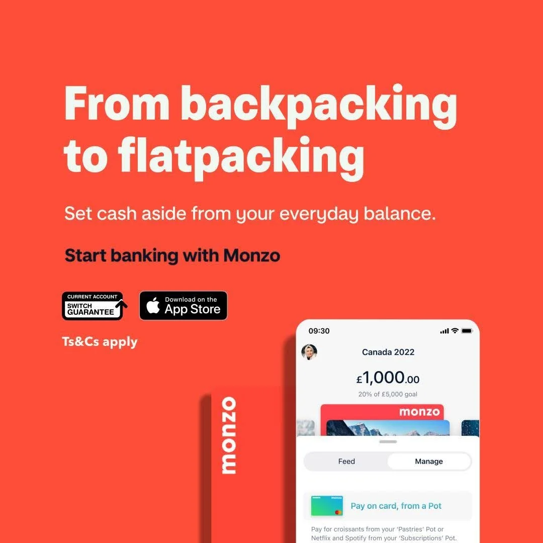
Once we launched our rework campaign, we began looking at how we could tweak the visuals as well. The most obvious thing to us was the use of their brand’s “Hot Coral” colour, which hadn’t been utilised at all beyond the inclusion of their bank card in previous assets. Including visuals of the app was essential to show users how specific features looked, and how they worked. That, tied with relatable copy that tapped into the core audience segment - people transitioning from their twenties into their thirties, and acknowledging the changing priorities that come with it.
We also ran tests on logo and wordmark placement, as Monzo had mentioned wanting to rebrand and move away from the M logo. So we took it as a cue to experiment with different ways to brand the ads - using the old logo, just the wordmark, or the card itself on various tests. We didn’t realise at the time but this single decision would play a huge part in the brand’s eventual rebrand a year later.
ASO Refresh
Channels: App Store & Play Store
Year: 2022
We’d seen a lot of success with our paid social work over Q4 of 2021, so much so that Monzo expanded our remit to overhaul their App Store and Play Store look and feel.
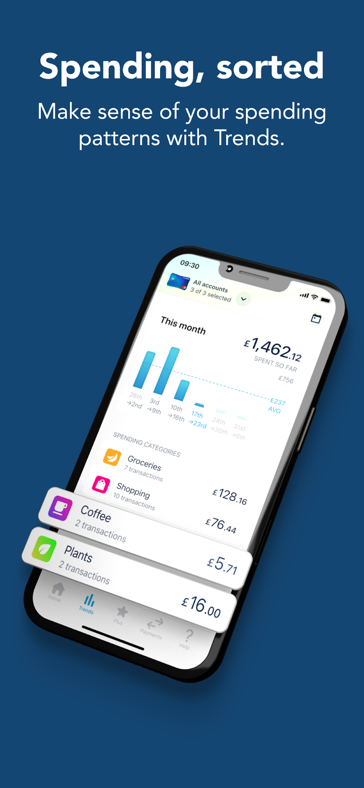
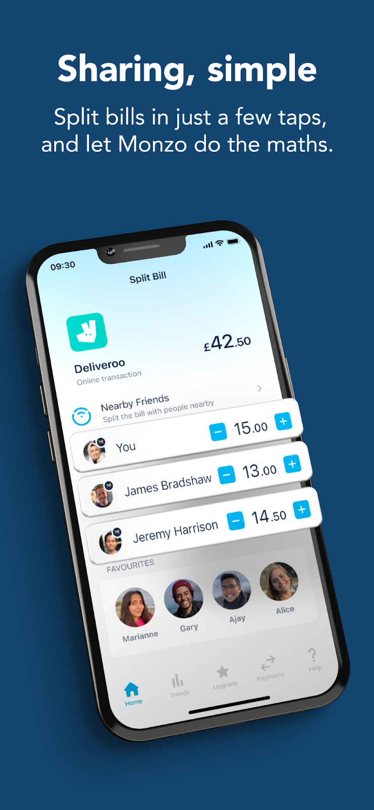
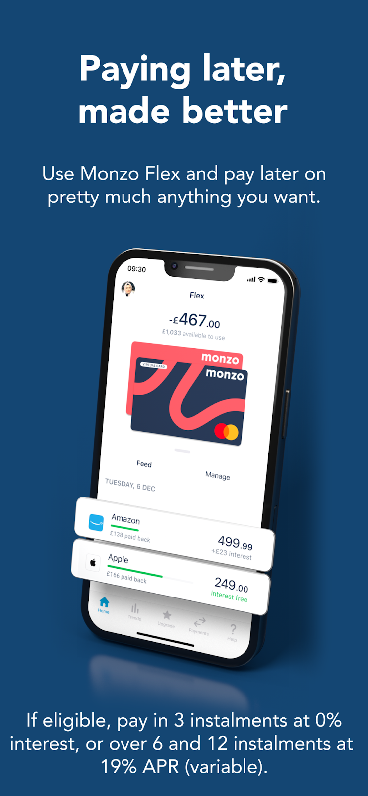
We rebuilt and remade everything from the ground up, focusing on the key features that our insights from our previous marketing had identified as the biggest hooks for potential new users. The Monzo team weren’t quite ready to roll out the bolder colour scheme we’d been experimenting with, so we stuck with their more traditional navy background, but we were able to utilise 3D modelling to give the pages more depth and character.
Original
Updated
Iteration
Refer a Friend Campaign
Channels: Facebook, Instagram, UAC
Year: 2022
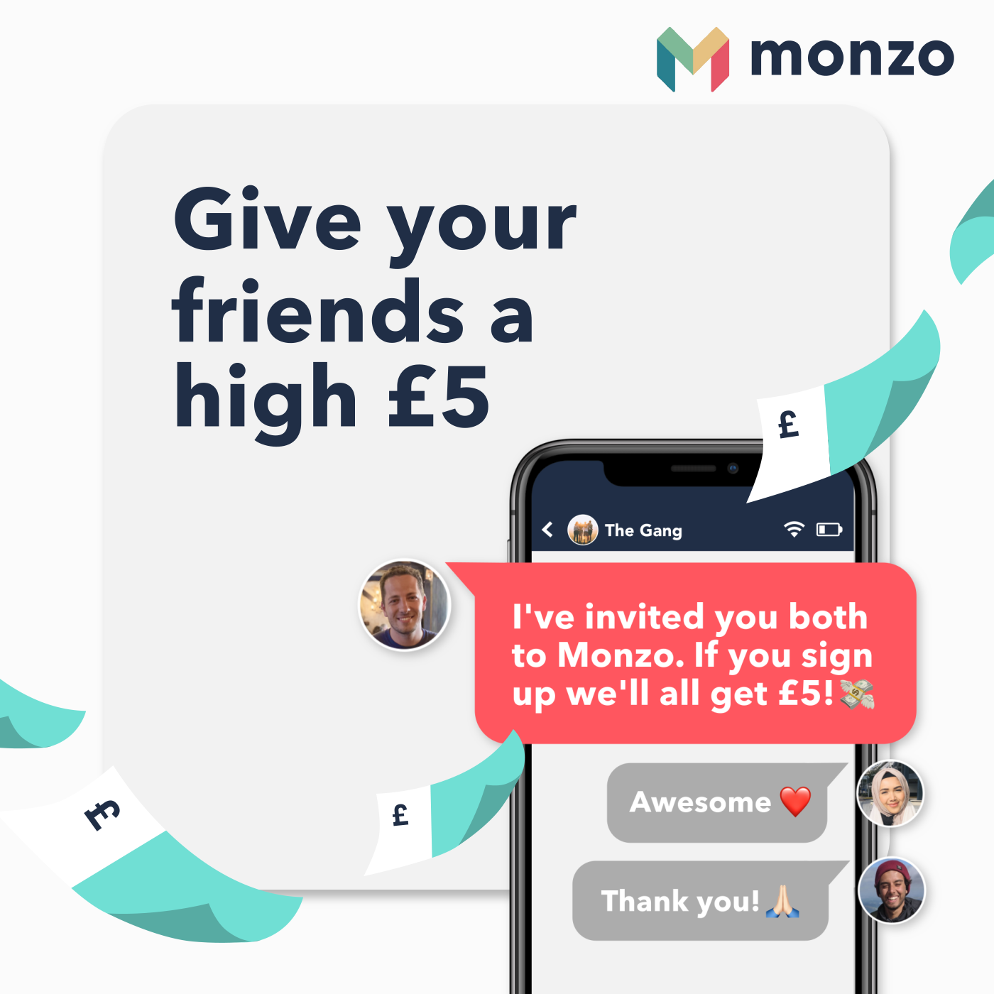
The refer a friend campaign was dropped onto our proverbial desks with a very tight turnaround in early 2022, as Monzo wanted to get it live while people were still at the stage of taking their new year resolutions seriously. We had about 2 weeks to get this from brief to live, so it was agreed we’d utilise existing visual assets to help us streamline the process.
That didn’t stop us from testing different versions though, so we experimented with different straplines and visual aesthetics to try and gather as much data as possible despite the time constraints. Copy in particular was heavily influenced by our previous learnings, with the playful, light-hearted tone being by far the most successful.
Rebrand Legacy
Year: 2022
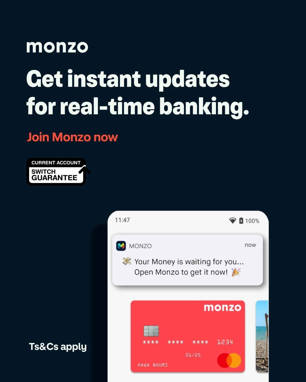
After just over a year of testing new visual and messaging routes, the Monzo rebrand was launched. It was heavily influenced by our work, which showed the cautious Monzo marketing team that more colour, more playful copy, and simpler aesthetics would connect far more with potential users than the slightly childish illustrative approach they’d been using in the past.
We reworked our most successful assets into the new branding colourways and typography, with several of them being featured within the Monzo brand guidelines. It was incredibly gratifying to see that our work played such a significant role in helping this brand “grow up” (their words, not mine!).
